IN THIS ARTICLE
Component Card UX Pattern
A component card groups together the related property settings of a certain feature. For instance, component cards appear in the Inspector in the Open 3D Engine (O3DE) Editor, which displays the components of the entities in your project. The component card must present the property settings in a structured and intuitive way to help a user understand how to correctly configure the property settings. If the information isn’t presented clearly on the component card, the user might get confused, set the wrong values, or miss important information in the settings—all of which might cause system errors or unexpected results.
General rules for creating component cards: When creating a new feature you should consider the following:
Who will use this component card and what is their level of expertise?
Is your component a Level component or a standard component?
How do you want to structure your card component?
What repetitive actions are you requesting from your user to do and can this be simplified at all?
Have you set up the proper default values?
Are there any dependencies with your component? Refer to Automatically add components.
How will your component card interact with the viewport?
Does my component have buttons?
Component needs to be fully inclusive and not broken into a bunch of micro components.
Empty component card must include a message specifying why this component card is empty.
Consider writing a small description of what the component does. Links to documentation are also allowed.
Use the toggle component for binary actions. Check boxes for multi select action and radial for choose 1 of the following.
Use sliders when a user needs to eyeball the results in the view-port. Please see slider for different types.
Use drop-downs when all the known variables can be accounted for. Try to keep the list under 20 or consider breaking the list into two drop-down to reduce the mental load of looking through a massive list.
Any field that need to be adjust based on 3 dimensions needs to use have the XYZ value attached before the input file
Layout and spacing
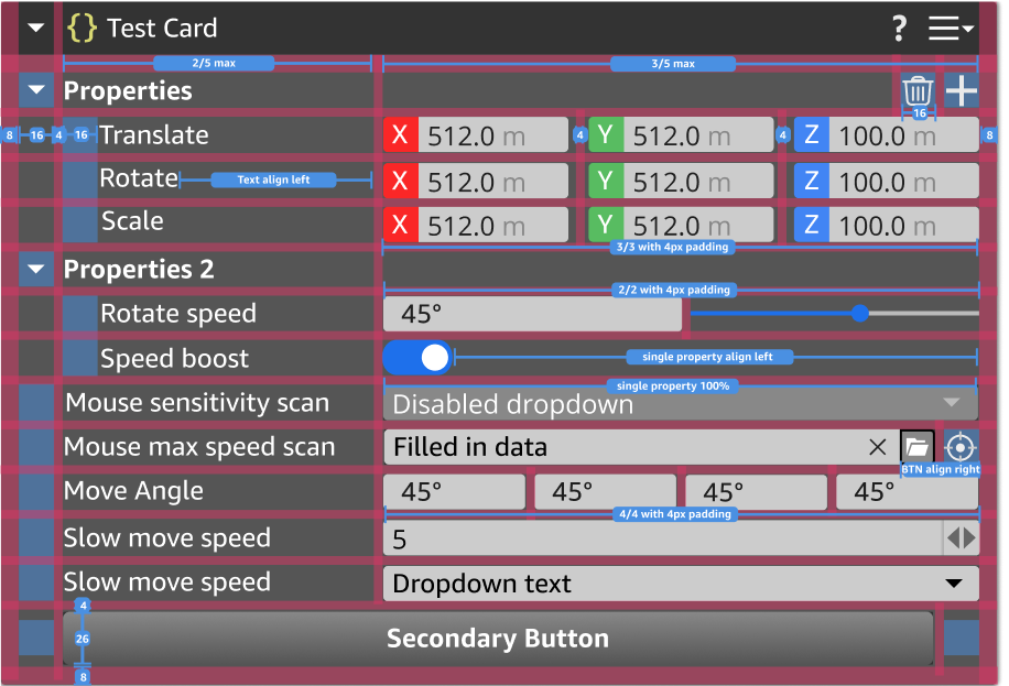
Component cards have two primary patterns 1 or 2 column layout. Priority is given to the input field when compressed. Two column layout is the most standard. The min card width is —- while there is no max card size. Titles will get compressed based on card size will uses ellipses with a tooltip on hover of the title. When done in reverse we remove the ellipses and show the full title. Text is left aligned and uses only four levels of a tree hierarchy inside a component card. We try not to go any deeper than 4 levels because the indentation limits the amount of viewable space. All Input fields should fill the space available and be right aligned.
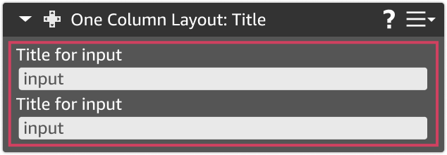
One column layout
One column layout is best for larger input text area. For example, our comment card uses a 1 column. In this situation the priority of the component card is the maximum amount of input space.
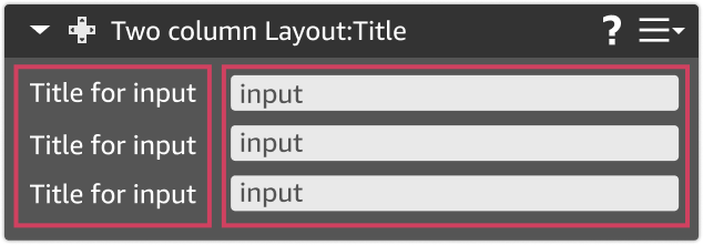
Two column layout
Two column layout is roughly 2/5th width by 3/5th width. A minimum size is set on both input field and title. The global minimum input field size is set based on the properties that take up the most space. That would be based on a vector 4 field layout. This leaves roughly 7 or 8 character per input field.
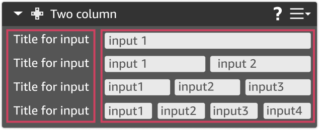
Input field layout
Input field layout: Component properties that have multiple properties all related to one function can be laid out in one the four ways by default. Please note that input field spacing takes priority over title. This means input fields are given priority over titles. All compressed items will go into overflow mode.
Structuring your content
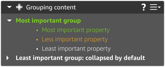
Structuring your content: When building a component, think about how a user might want to use a set of features at the same time. Alway add the most important / most used features near the top the component card. Keep advanced features or less used feature collapsed by default to minimize the users stress factor. SubSection Headers are also bold bu default.
Things O3DE manages for me
Some operations in card components are handled by O3DE. You don’t need to manage these yourself, but it’s important to be aware of how O3DE handles your card components.
Status: Conflict or required components
In some circumstances some components will depend on another component card to work properly. An good example of this PhysX. PhysX can’t work without having mesh or shape defined. So a user would be shown the following component to add that secondary setting. While a missing component warning appears all the input fields in the card would be disabled, the header would have the checkered pattern.

Status: Component is broken
In some rare situations a component can be broken based on some larger scale problem. An example of this is disabling or missing Gem. If a developer uses several Gems to create a feature. Sometime one feature can be hosted in one Gem while another can be hosted in a different Gem. In these situation we produce

Status: Disable card
Currently we offer the ability to disable cards. However using this feature should only be done if something the user can do to make it active within the same session. This state should only be used in conjunction with another visualization explaining the state change.

Status: Unsaved property changes
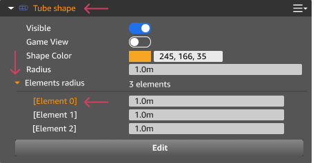
This change reflects the users current state of saving. The update will happen regardless of the header is collapsed or not. This modification will remain until the user has saved their level. The color is (E59D25). This color change should show up on three levels of the visual architecture. The title (for when the component card is collapsed), the collapsible triangles (properties that are hidden behind a collapsed section), and the property title effected by this change (directly next to the property changed). When the use clicks save or Ctrl + S the orange is removed and it reverts back to white. Prefabs instantly reflect the changes a user has made to all other instance of that object. So why would properties show up as orange? Good question. Even though we are reflecting the changes to those properties . These changes have not been save to disc and the ornage is a reflection of what has been saved. In our example it has only been set temporarily and still need to be saved to disc.
Status: Restricted drag state
In some situations a component card cannot be moved. In this situation you may see a red border around the component card. This lets the user know the action attempted is not possible. An example of this is when a user tries to drag a component inside another component. This behavior is not allowed and will result in a red board on Click drag hold. Another example would be dragging a component into another window.
Component buttons
Users often need to set or update a specific property related to a field in a component card. BJDS provides a set of buttons that you can include in your component card to solve most use cases. These buttons can be found inside the icon directory (todo) in your game engine.
If you need a button for an action that’s not listed here, please contact O3DE’s UX/UI Special Interest Group (SIG). We can help you create a button for your use case, and make it universal so others can use it as well. Creating unique button for some components is discouraged because it may cause confusion among users.
Back to previous : Return the user back to a previous state
Pining: This property is set to be visible on a higher level. You can see this used on prefab properties.
Locate on perspective window: Use this button to set a property value based on click in the perspective window to set property.
Clear set property: This should be used to remove a property value and or a set of properties value. Unlike delete this one should not remove the filed as well. We tried to reserve the meaning of the “X” for things like “clear this field” or “close this window”. The trash can is being used for remove setting or delete elements.
See more properties:
Configure / Play.
Run command
Add property. We commonly use this for adding a new property or a set of properties
Delete property. This will completely remove the property from your component card. Most of the time this us used in connection to the plus sign
Open new window
Refresh properties or settings
Find in explorer.
Override property

Things you will need to manage
Level component vs standard component
In O3DE, there are two levels of components: a standard component and a level component. A standard component deals with specific set of functionality that applies to a feature. Level components on the other hand are large features on a component that apply to the entire level and do not need to be exposed in the outliner. These level components are things like Global lighting, physics, terrain, etc. So when building your new component. Consider should this component live on entity or is it a component that is used across your entire level


Things to avoid
There are several patterns over the years we have learned to follow in order to create the best experience for our users.
Ask yourself, Is the setting really necessary? I know at first throwing every property on a component card seems like a good idea. However the research on this would disagree. Overwhelming users with too many choices or trivial choices cause a type of user paralysis.
Only show data that is useful and 80% of your user. Avoid catering the 20% advanced group.
Group related settings together.
We should never use single property nested under a Subsection header.
We try to limit the number of tree structures under a card to be 3. Any more than 3 is almost impossible to read because everything is too compressed.
Empty component cards
Can you use empty component cards. Well technically there is no code limitation on this behavior but it’s highly discouraged. During user research it was reported that seeing an empty card make people thing component are broken. A reason someone might want to use an empty component card is just backend plumbing and have your tool registers to a system. In the case of needing this state you should make sure the follow is done. In most cases component cards should have properties inside them that offer a customer a choice or modifying a feature or a function. If the component doesn’t have any properties, you should ask yourself: Is there anything I can add to help users understand why this component would be empty.

Provide good default settings
All properties should have our best effort to select the default we think everyone would like. Sometime we will get this wrong, and that’s ok. When we learn more we iterate. However the experimentation that will be required for our user to get their best guess of what should work is way too much effort. Lets save them time and set our best guess and good default values.
Units of measure
We support many type of units of measurements in our input fields. These unit of measurements are include inside the input field in a lighter color than the standard text. Our most common unit of measurements are Meters (M), but you might also see pixels (PX), lumens (LM), Hex (#), and Degrees (° or deg) .. These help text are not built into the control but a modifiable property so you can add whichever unit type you would like. So it’s up to you to keep our properties from becoming disjointed. We strongly suggest using universal measuring units like the metric system.
(image to do)
Sorting inside a component (dragging)
Currently the basic component card doesn’t support row sorting or order stacking as its not needed inside all instances. However, we do support this behavior as part of the Array component inside component cards. This will allow you to pull down stacking ordering or allowing user to reorganizing content. Please read more about this in the “Array” component.
Sort order of a component card (dragging)
All cards are able to be sorted inside the inspector window with the exception of the transform card. We lock the transform card to the top of the inspector so this card will always be in position 1. Changing position of the other cards allows most user to organize their by dragging around cards. Blue border and outline lets the user know this item can be moved into this position, which a red border say this location is not possible. Please note that the stacking order of component cards inside the inspector means nothing about order of importance to the editor or processor. It also doesn’t effect the z-index position in the viewport. The cards are just stacked visually to help the user not related to hidden functionality.
Interacting with the viewport
Interaction with the component card and the viewport should happen instantaneously. In some situations in which we refer to another file on disc. In these situation we might want to include a secondary button to force update change. The other major viewport change is reflect with the large “edit” button you will see at the bottom of all of our shape components. This action put the viewport into edit mode will have some visual indicators such as the blue border to let the user know changes have taken place. Please note in edit mode you can restrict the users ability to click on other action so they can focus on your workflow.
Tool Tip
Please use them on all properties describe the action does not what you want them to do.
Component icons
Component card icons should never use boxes around the icon. The boxed version is for the perspective window only. We don’t want our icons to take away from the customers focus. New icons should match the appropriate color catagory for the component category. Please see the icons page for more details.
Dependent components
When designing the component, think about the end-to-end workflow for your component. Is the component you are building part of another tool or workflow? Are there other dependent components with your component? Define the E2E workflow With the understanding of this end-to-end workflow, you can think ahead for your users, and help your user automate their workflow as much as possible to save time.
Can we automatically add components?
Yes! An example of this is; If a user drags out an FBX from Asset Browser and it includes a Mesh, a Material, and a Physics collider. It would simplify the users experience to automatically add these components together. It would be easier for the user to decided they don’t want some of these components and change or delete them then set them up from scratch. Please also see status
However, we do not want to force a user to keep a component they do not want. So please do not set up any systems where components are automatically added back when someone deletes that component. Forced components adding is not something we should endorse. If a user deletes a components, they had a reason. In this case please use Status: Conflict or required Components
