IN THIS ARTICLE
Error Messages in Dialogs
Dialogs inform users about specific tasks and requires immediate response from the user. It can also contain other relevant information or request user input. A dialog is highly disruptive to the user and must be used sparingly. Dialogs may be prompted by the user’s action or by the system to request input from the user or to give users critical information about their workflow.
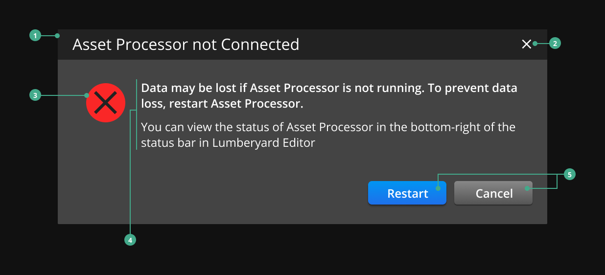
Structure of a dialog
Header: Contains a title and close button.
Close Button: Closes the dialog without resolving the issue.
Icon: A standard icon and has a size of 48 x 48px. Refer to Standard Icons.
Body: Contains information regarding the user’s task and how to resolve it.
Actions: The primary and optional secondary call-to-action buttons that resolve or exit the dialog.
Types of dialogs
| Type | Usage |
|---|---|
| Modal | Displays critical information or requests necessary input from the user. |
| Non-modal | Displays relevant information or requests non-critical input from the user. This task may not be needed to complete the user workflow. |

Specifications
Review these specifications when creating a dialog:
Do not include the O3DE Logo Mark in the header of a dialog.
Briefly describe the dialog’s task or purpose in the title in the dialog’s header.
Write relevant information to help users complete the dialog’s task in the title and body of the dialog. Refer to Guidelines for Writing Error Messages.
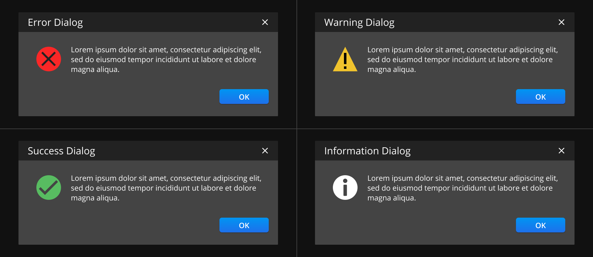
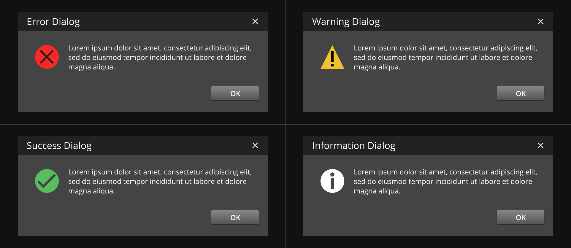
Include only one icon, if any. Use one of the following icons from the list of Standard icons: error/failure, warning, success, or information icon.
Include a primary button and/or an optional secondary button for the dialog’s actions.
- Use the primary button for a primary action. Primary buttons have a blue background, making it more distinct to the user. Write an actionable text on the primary button such as “Save”, “Restart”, or “Open”.
Use the secondary button for alternative options or passive actions such as “Cancel” or “OK”.
Best practices
Use dialogs sparingly. Dialogs are disruptive and can annoy the user if used incorrectly or repeatedly.
Use modal dialogs to stop the user’s workflow until they resolve the dialog.
Use non-modal dialogs as a part of a positive reinforcement of a workflow.
Only use dialogs if the message requires the user to take action.
Examples
Dialog without an icon
Dialogs without an icon are recommended for non-modal dialogs.
![]()
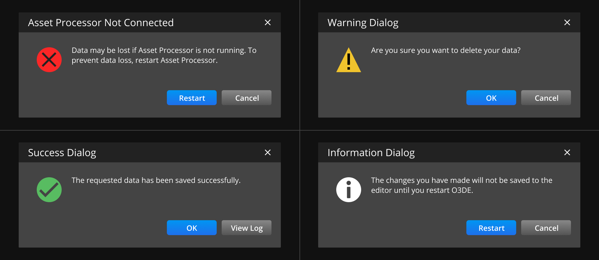
Dialog with one action
Dialogs with one action may use a primary or a secondary button. This is recommended for a dialog where the user is either accepting or agreeing to something or if the dialog is purely informational.
Dialog with two actions
When using a dialog with two actions, place the primary button on the left and the secondary button on the right.
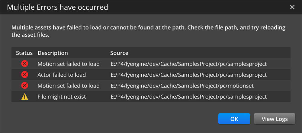
Dialog with multiple messages
You can consolidate multiple error messages into a single dialog by using a table. Consider using this when the user completes a set of actions and can evaluate the errors that might’ve occurred at one time. Since dialogs are disruptive to the user’s workflow, the fewer dialogs that appear, the better.
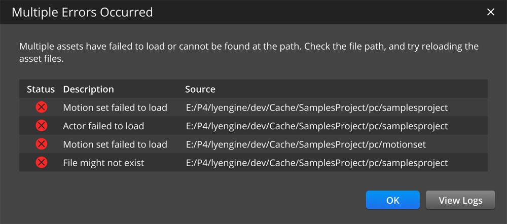
You can also hide the list of error messages in a collapsible table, so users can choose to view the details if they desire.

Link to log files that are relevant to the issue, if applicable. This allows users to resolve their issues and expedite their workflow.
Dialog with a long message string
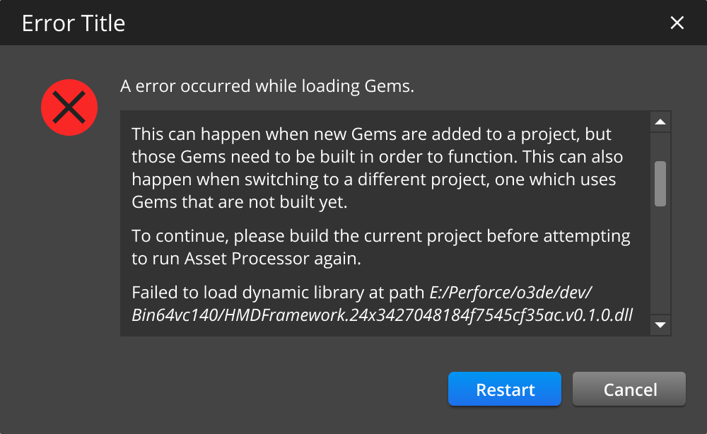
Error messages may need to describe lots of details to be effective to the user. In this case, consider using a dialog with a scrollbar.
