UI Dropdown Component
You can use the Dropdown component to make an element behave like a drop-down menu. Use this component with child elements that contain content. The child elements provide the contents of the drop-down menu.
You can use the Dropdown component with the DropdownOption component. With the DropdownOption component, you can configure options to change the menu text and its icon after it is selected.
To see in-game examples of completed canvases with the Dropdown component, open the level UiFeatures in the project SamplesProject. Press Ctrl+G to play the game, and then choose Components, Interactable Components, Dropdown. You can view Simple Dropdowns, Nested Dropdowns, Multiple Select & Functionality, and Using UI Components and Dropdowns. Press Esc to exit the game.
To view these same canvases in the UI Editor, navigate to the \Gems\LyShineExamples\Assets\UI\Canvases\LyShineExamples\Comp\Dropdown directory. You can open the following canvases:
MultipleFunc.uicanvas- Multiple selection drop-down menu and functional drop-down menu (perform actions on a ball such as create, destroy, move, and change color)Nested.uicanvas- Two levels and multilevel with siblings submenusSimple.uicanvas- Simple selection drop-down menu, selection drop-down menu with icons, expand on pause drop-down menu, and expand on pause with iconsUsingUi.uicanvas- Drop-down menus with a scroll box, image, check box, slider, and radio buttons
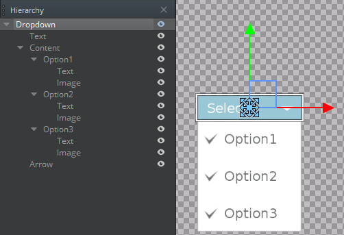
You can add a prebuilt Dropdown element from the slice library. When you do this, a drop-down menu, three options, and their image elements are automatically created in your Hierarchy pane.

To add a Dropdown element from the slice library
- In the UI Editor, choose New, Element from Slice Library, Dropdown.
To edit a Dropdown component
In the Properties pane of the UI Editor, expand Dropdown and do the following, as appropriate:
Interactable
See Properties to edit the common interactive component settings.
Elements, Content
Select an element from the list. This specifies the entity that appears when the drop-down menu is expanded.
Elements, Expanded Parent
Drag an element onto the Expanded Parent box. This specifies the entity that serves as the parent when the drop-down menu is expanded. This is used to layer drop-down menus.
Elements, Text Element
Select an element from the list to specify the entity to display the text corresponding to the selected option.
Elements, Icon Element
Select an element from the list to specify the entity to display the icon corresponding to which option is selected.
Options, Expand on Hover
Select to enable drop-down behavior upon pause and collapse upon exit.
Options, Wait Time
Enter a number of seconds that the drop-down menu waits before expanding on pause or collapsing on exit.
Options, Collapse on Outside Click
Select to enable drop-down menu collapse upon clicking outside the menu.
Dropdown States, Expanded
Click plus to add states to the drop-down menu when it is expanded.
Actions, Expanded
Enter a text string to be sent as an action on the UI canvas when the drop-down menu is expanded.
Actions, Collapsed
Enter a text string to be sent as an action on the UI canvas when the drop-down menu is collapsed.
Actions, Option Selected
Enter a text string to be sent as an action on the UI canvas when a drop-down option is selected.
Cpp
To create your own UI components, check the Working with UI Components page.
Once the component is available in the UI editor; and the UI dropdown is in the canvas; you can attach the cpp component to it.
Open your component header, include the UiDropdownBus and inherit from UiDropdownNotificationBus. In order to listen or handle one and only one address use ::Handler. In order to listen to multiple addresses use::MultiHandler. An EntityID is advised too so you can connect and disconnect the dropdown. Expanded, Collapsed and ValueChanged are the events obtained through the inheritance. Here is an example of what you should have in your header:
#pragma once

#include <AzCore/Component/Component.h>
#include <MyCustomGem/MyCustomExampleInterface.h> //interface should match your custom gem and component
#include <LyShine/Bus/UiButtonBus.h>

namespace MyCustomGem // namespace should match your custom gem
{
    class MyCustomExampleComponent: public AZ::Component, public MyCustomExampleRequestBus::Handler, private UiButtonNotificationBus::Handler // , private UiButtonNotificationBus::MultiHandler
    {
    private:
        AZ::EntityId m_dropDown;
        /// rest of the code...
    public:
        void OnDropdownExpanded() override;
        void OnDropdownCollapsed() override;
        void OnDropdownValueChanged([[maybe_unused]] AZ::EntityId option) override;
Inside your cpp file you should connect your dropdown bus when the component is activated; and disconnect it when the component is deactivated. To evaluate if the events are working as expected, you can print something in the console. Even if you test this in the UI Editor, the messages will appear in your Game-Editor console.
    /// other code...

    void MyCustomExampleComponent::Activate()
    {
        MyCustomExampleRequestBus::Handler::BusConnect(GetEntityId());

        UiDropdownNotificationBus::Handler::BusConnect(m_DropDown);
    }
    void MyCustomExampleComponent::Deactivate()
    {
        MyCustomExampleRequestBus::Handler::BusDisconnect(GetEntityId());

        UiDropdownNotificationBus::Handler::BusDisconnect(m_DropDown);
    }

    void MyCustomExampleComponent::OnDropdownExpanded()
    {
        AZ_Printf("MyCustomExampleComponent", "Dropdown expanded.\n");
    }
    void MyCustomExampleComponent::OnDropdownCollapsed()
    {
        AZ_Printf("MyCustomExampleComponent", "Dropdown collapsed.\n");
    }
    void MyCustomExampleComponent::OnDropdownValueChanged([[maybe_unused]] AZ::EntityId option)
    {
         AZ_Printf("MyCustomExampleComponent", "Dropdown value changed.\n");
    }

    /// rest of the code...
