UI Radio Button Group Component
You can use the RadioButtonGroup component to manage radio buttons. This component handles selecting and clearing the radio buttons in the group when appropriate. It also ensures that only one radio button is selected at one time. You typically use this component on an element with children radio buttons, which are part of the radio button group.

To see in-game examples of completed canvases with the RadioButtonGroup component, open the level UiFeatures in the project SamplesProject. Press Ctrl+G to play the game, and then choose Components, Interactable Components, RadioButton. You can view examples of different behaviors, default settings, and groups for radio buttons Press Esc to exit the game.
To view these same canvases in the UI Editor, navigate to the \Gems\LyShineExamples\Assets\UI\Canvases\LyShineExamples\Comp\RadioButton directory. You can open the following canvases:
Groups.uicanvas- Examples of different radio button groupingsRadioButton.uicanvas- Examples of different behaviors and default settings
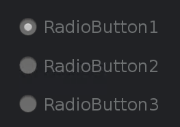
You can add a prebuilt RadioButtonGroup element from the slice library. When you do this, a group of three radio buttons is automatically created in your Hierarchy pane.
To add a RadioButtonGroup element from the slice library
- In the UI Editor, choose New, Element from Slice Library, RadioButtonGroup.
To edit a RadioButtonGroup component
In the Properties pane of the UI Editor, expand RadioButtonGroup and do the following, as appropriate:
Settings, Allow uncheck
Select to enable the clearing or unchecking of selected radio buttons.
Actions, Change
Enter a text string. This string is sent as an action on the UI canvas when the radio button group has any state changes.
