UI Scroll Box Component
You can use a ScrollBox component to present content, such as images or text, within a scrollable area.
This component is typically used with a mask component, which hides the content outside of the masked area.

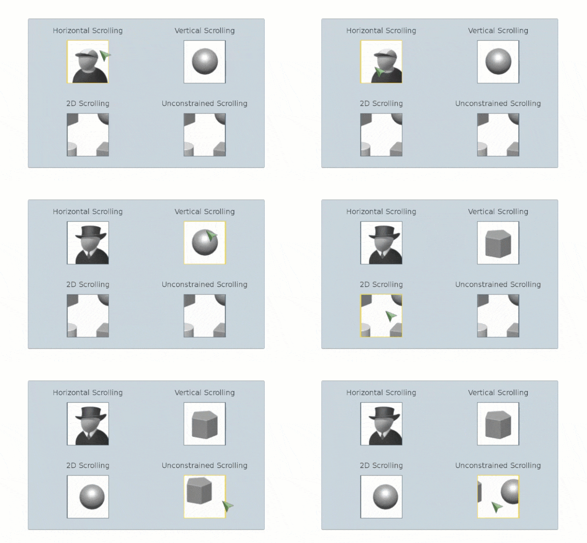
To see in-game examples of completed canvases with the ScrollBox component, open the level UiFeatures in the project SamplesProject. Press Ctrl+G to play the game, and then choose Components, Interactable Components, ScrollBox. You can view examples of different scrolling options, snapping options, interactions between scroll boxes and other components, and nested scroll boxes. Press Esc to exit the game.
To view these same canvases in the UI Editor, navigate to the \Gems\LyShineExamples\Assets\UI\Canvases\LyShineExamples\Comp\ScrollBox directory. You can open the following canvases:
Interactions.uicanvas- Examples of interactions between scroll boxes and other interactive componentsNested.uicanvas- Examples of nesting scroll boxesScrolling.uicanvas- Examples of different scrolling options such as horizontal, vertical, 2D, and unconstrainedSnapping.uicanvas- Examples of different snapping options
You can add a prebuilt ScrollBox element from the slice library. When you do this, a mask, content, and image elements are automatically created and nested in your Hierarchy pane.
To add a ScrollBox element from the slice library
- In the UI Editor, choose New, Element from Slice Library, Scrollbox.
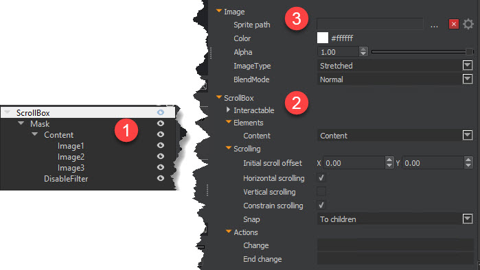
The element named ScrollBox (1) has the ScrollBox component (2) applied to it. You can add an image to the ScrollBox element’s Image component (3), which acts as the visual frame for the scroll box. Because the mask element and its child elements are drawn in front of the scroll box element, you see only the edges of the image on the ScrollBox component. To increase or decrease the viewable area of this image, adjust the offsets in the mask element’s Transform2D component.

The element named Mask has a Mask component applied to it, which acts as the viewport through which you can see the content. To specify a custom mask, you can add an image to the Mask element’s Image component. The contents are drawn to the visible area of the mask; the transparent area of the mask hides content.
To edit a scroll box component
In the Properties pane of the UI Editor, expand ScrollBox and do the following, as appropriate:
Interactable
See Properties to edit the common interactive component settings.
Content, Content element
Select an element from the list to provide the content to be displayed within the scroll box.
Content, Initial scroll offset
Enter the initial offset value of the content element’s pivot point from the parent element’s pivot point.
Content, Constrain scrolling
Select the check box to prevent content from scrolling beyond its edges.
Content, Snap
Select a snapping mode:
- None - No snapping.
- To children - When a drag motion is released, the content element moves in such a way that the closest child element’s pivot point is snapped to the parent element’s pivot point. You can use this, for example, to center a child element in the scroll box when the dragging stops.
- To grid - When a drag motion is released, the content element’s pivot point is snapped to a multiple of the grid spacing from the parent element’s pivot point.
Horizontal scrolling, Enabled
Select the check box to enable content to scroll horizontally. If the element, or its parent, is rotated, then the axis of scrolling is also rotated. You can enable horizontal scrolling simultaneously with vertical scrolling to scroll in both directions.
Horizontal scrolling, Scrollbar element
Select an element from the list to provide the horizontal scroll bar associated with the scroll box.
Horizontal scrolling, Scrollbar visibility
Select the visibility behavior of the horizontal scroll bar:
- Always visible - Scroll bar is always visible.
- Auto hide - Scroll bar is automatically hidden when not needed. Scroll bar is resized according to visibility of the vertical scroll bar.
- Auto hide and resize view area - Same as Auto hide, but the view area is also resized smaller when the scroll bar is visible and larger when the scroll bar is hidden. Vertical scrolling, Enabled
Select the check box to enable content to scroll vertically. If the element, or its parent, is rotated, then the axis of scrolling is also rotated. You can enable vertical scrolling simultaneously with horizontal scrolling to scroll in both directions.
Vertical scrolling, Scrollbar element
Select an element from the list to provide the vertical scroll bar associated with the scroll box.
Vertical scrolling, Scrollbar visibility
Select the visibility behavior of the vertical scroll bar:
- Always visible - Scroll bar is always visible.
- Auto hide - Scroll bar is automatically hidden when not needed. Scroll bar is resized according to visibility of the vertical scroll bar.
- Auto hide and resize view area - Same as auto hide, but the view area is also resized smaller when the scroll bar is visible and larger when the scroll bar is hidden. Actions, Change
Set the action that is triggered during dragging each time the position changes.
Actions, End change
Set the action that is triggered when a drag motion is completed.
