UI Layout Column Component
You can use a LayoutColumn component to organize child elements into a column. To use this feature, add the LayoutColumn component to an element and then add child elements. The UI system positions the child elements within the column, from top to bottom or bottom to top, depending on the order you choose in the component properties. The child elements can contain a texture or image, a button, a check box, text, columns, rows, grids, and so on.
To see an in-game example of a completed canvas with the Layout Column component, open the level UiFeatures in the project SamplesProject. Press Ctrl+G to play the game, and then choose Components, Layout Components, Layout Column. You can view examples of different child sizes within a column. Press Esc to exit the game.
To view this same canvas in the UI Editor, navigate to the \Gems\LyShineExamples\Assets\UI\Canvases\LyShineExamples\Comp\Layout directory and open the SimpleColumn.uicanvas file.
You can add a prebuilt Layout Column element from the slice library. When you do this, a simple layout column is automatically created and nested in your Hierarchy pane.
To add a Layout Column element from the slice library
- In the UI Editor, choose New, Element from Slice Library, LayoutColumn.
By default, the layout column gives every child the same amount of space, regardless of its content. You can, however, manipulate the sizes of each child by adding the LayoutCell component to each or specific children.
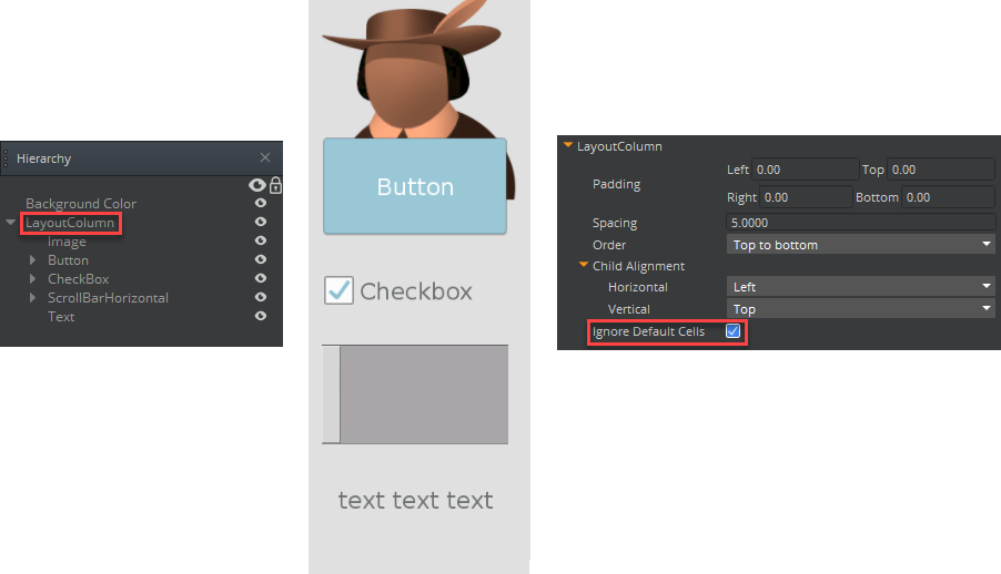
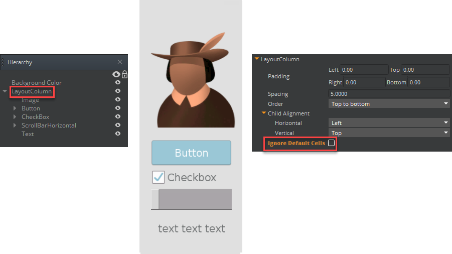
The layout column can also give varying space to each child depending on its content. To enable the layout column to do this, clear the Ignore Default Cell option in the LayoutColumn component’s properties.
In the first image, Ignore Default Cells is selected. The layout column gives each child the same amount of space regardless of their contents.

In the second image, Ignore Default Cells is cleared. The layout column calculates its children’s space based on their contents.

To see an example of a completed canvas with the layout column component, open SimpleColumn.uicanvas in the LyShineExamples Gem \(`\dev\Gems\LyShineExamples\Assets\UI\Canvases\LyShineExamples\Comp\`\).
To edit a layout column component
In the Properties pane of the UI Editor, expand LayoutColumn and do the following, as appropriate:
Padding
Type values in pixels, relative to the element’s borders.
Spacing
Type values in pixels to adjust spacing between elements.
Order
Select Top-to-Bottom or Bottom-to-Top to specify the order in which the child elements appear in the column.
Child Alignment
If the layout’s children don’t occupy all the available layout space, use this setting to determine how the children are aligned.
For Horizontal, select Left, Center, or Right to determine how the children are aligned horizontally.
For Vertical, select Top, Center, or Bottom to determine how the children are aligned vertically.
Ignore Default Cell
Selected by default, this property causes the layout column to give each child an equal amount of space regardless of their contents (unless the child has a LayoutCell component). The layout column ignores the layout cell’s content-based default calculations.
When you clear this option, the layout column uses the children’s layout cell calculated values to determine how much space to give each child based on its contents. For more information, see LayoutCell.
