IN THIS ARTICLE
UI Text Component
You can use a Text component to add a text string to an element. Use the Properties pane of the UI Editor to configure the following settings for the Text component.
Text Settings
| Name | Description |
|---|---|
| Text | Enter the preferred text string and press Enter. You can also apply text styling markup. |
| Enable markup | If selected, the text string is parsed for markup tags. For more information, see Text Markup. |
| Color | Click the color swatch to select a different color. |
| Alpha | Use the slider to choose an alpha value between 0 and 1. |
| Font path | Click the button and select a font .font file. For more information, see
Adding New Fonts. |
| Font size | Enter a font size and press Enter. |
| Font effect | Select an effect from the list. The available font effects are dictated by the font .font file. |
| Horizontal text alignment | Select Left, Center, or Right to align the text with the element’s left and right borders. |
| Vertical text alignment | Select Top, Center, or Bottom to align the text with the element’s top and bottom borders. |
| Overflow mode | Select Overflow to allow the text to display beyond the edges of the element. Select Clip text to hide, or clip, any text that flows beyond the element’s edges. |
| Wrap text | Select No wrap to prevent text from wrapping to subsequent lines. Select Wrap text to allow text to be broken into separate lines. |
Text Markup
You can customize the appearance of the text in your game UI with bold and italic styling, multiple text colors, and multiple fonts in a single text string. You can also embed images in the text.
To do this, enter specific tags directly into the Text box, along with your string. The simple markup language is loosely based on HTML.
To use the text styling markup feature, you must use a font family *.fontfamily asset file in the Font path setting \(rather than an individual `.font` asset file\). For more information about adding font families to your projects, see
Implementing New Fonts.
To use text styling markup
In the UI Editor, add a Text component to an element on your canvas (or modify an existing component).
With the element selected, in the Properties pane, set the Font path property to a
*.fontfamilyfile.Enter a string with markup styling in the Text box. See the next section for examples.
Styling Tags and Attributes
Example You can use the following tags and attributes when styling text with markup:
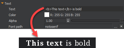
Bold tag:

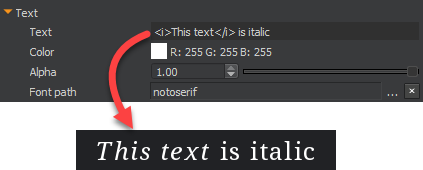
Italic tag:

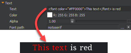
Font color tag:

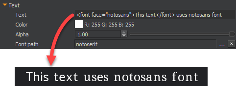
Font face tag:

Image Tag and Attributes
Use the <img> tag to embed an image in text.
Example
<img src="images/icons/button" vAlign="center" height="fontHeight" scale="1.5" yOffset="5" xPadding="6"/>

<img src="images/icons/button" vAlign="bottom" height="100" scale="0.8" yOffset="-3" lPadding="2" rPadding="6"/>
Use the following attributes to customize your image. Only the src attribute is required. All other attributes are optional.
| Attribute | Example | Description |
|---|---|---|
| src | src=“images/icons/button” | Asset path of the texture to display. |
| vAlign | vAlign=“center” | Alignment of image in the text area. The text area refers to the total height of the largest glyph in the font. If you don’t specify this attribute, the default alignment is baseline. |
| height | height=“100” | Sets the image height and adjusts its width to preserve the aspect ratio. If you don’t specify this attribute, the default alignment is fontAscent. |
| scale | scale=“0.8” | Scales the image by the specified scale factor. If not specified, this attribute defaults to 1.0. |
| yOffset | yOffset="-3" | Offsets the image vertically by the specified float value in pixels. If not specified, this attribute defaults to 0. |
| xPadding | xPadding=“6” | Adds equal spacing before and after the image by the specified float value in pixels. If not specified, this attribute defaults to 0.0. |
| lPadding | lPadding=“10” | Adds spacing to the left of the image by the specified float value in pixels. If not specified, this attribute defaults to 0.0. |
| rPadding | rPadding=“2” | Adds spacing to the right of the image by the specified float value in pixels. If not specified, this attribute defaults to 0.0. |
